How To Build a Web Component With Lit Elements
Transform Medium’s RSS feed into a list of preview cards

Use Lit Elements To Free Yourself From the Gravity of Heavy Frameworks (📸miszaszym)
Definition 📖
“Web components are a set of web platform APIs that allow you to create new custom, reusable, encapsulated HTML tags to use in web pages and web apps.” — webcomponents.org
Goals ✅
In this series, we will build a web component that transforms a Medium RSS feed into a list of preview cards that can be added to your blog or web app.
This article provides a walkthrough of various techniques that can be used to build flexible, extensible, and well-tested web components with Lit and @open-wc. Additionally, we’ll discuss testing strategies and automatically generate documentation for your web component.
A companion repo for this article can be found using the following link:
Web Components 🌐
With web components, you can create custom elements used in your app like any other HTML element but include their own custom behavior and styling.
Leveraging web components can make your app more efficient and maintainable, as you can easily reuse and modify your components as needed. Additionally, web components are designed to be framework-agnostic so that you can use them with any front-end JavaScript library or framework.
Overall, using web components can help you build a more scalable and flexible web app.
Prepare for Launch ⏳
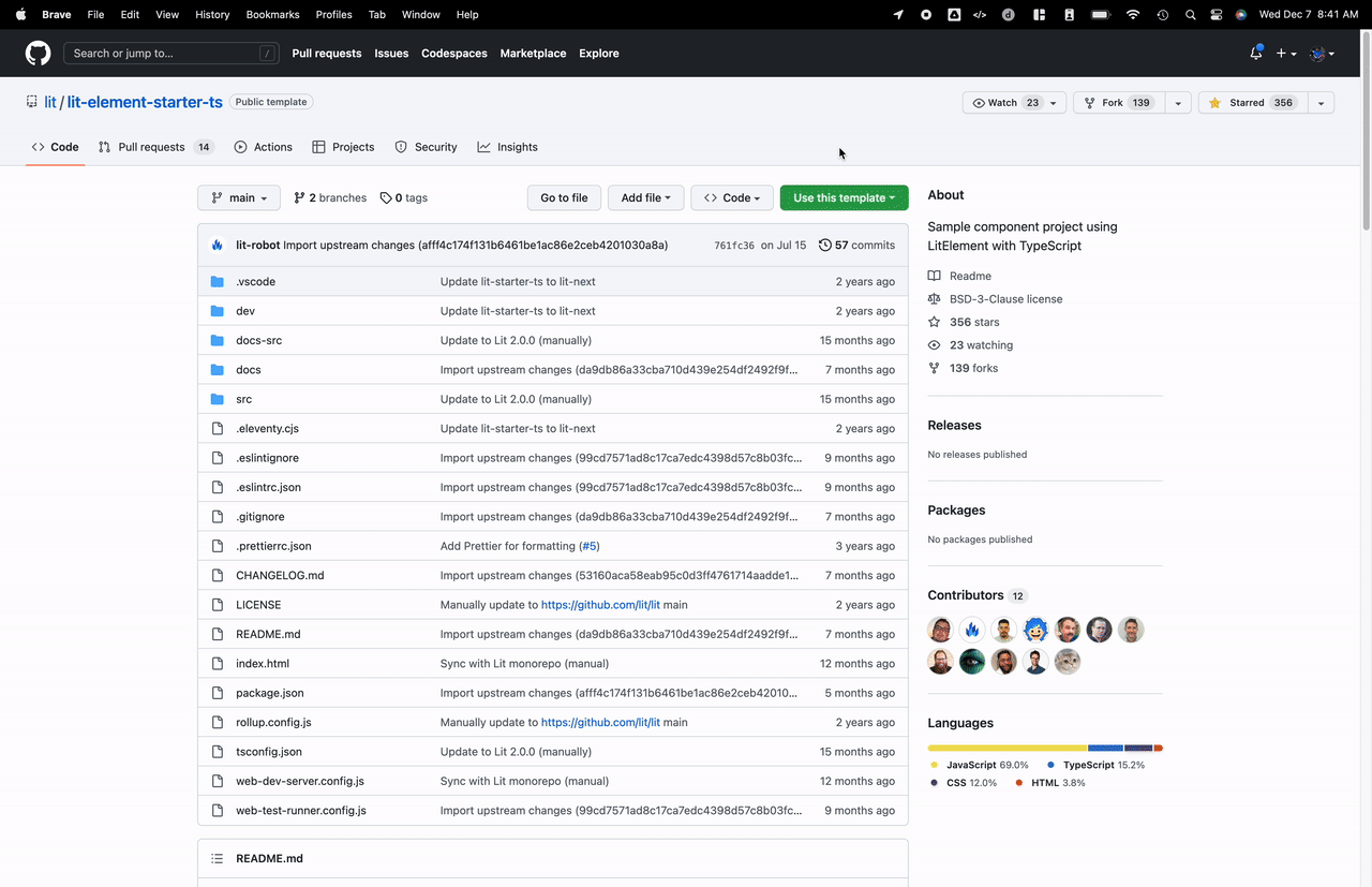
To get started, we will create a project based on the LitElement TypeScript starter repo. This template comes bootstrapped with many helpful tools to accelerate our development.
Let’s start by copying the template to our GitHub account.
If you’re interested in minimal setup, you can also use npm init @open-wc to start your project.
Next, clone the repo you created and install the project’s dependencies. Here’s how to do that:
git clone https://github.com/your-github-username/your-github-repo
cd your-github-repo
npm i
While developing our web component, we’ll want to run two commands in separate terminals. The first command will watch our source files and rebuild our component when anything changes. The second command will launch our development preview server.
Run the build:watch command in the first terminal window:
npm run build:watch
Run the serve command in a second terminal window:
npm run serve
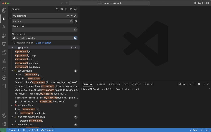
The second command should present a URL to open in your web browser. Navigate to the specified URL, click the Component Demo link, and ensure that you see something that resembles the following.
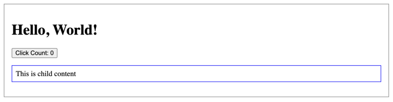
Nice! You’ve successfully built your first web component.
Before we move on, let’s also look at the documentation that the template generates. First, build the docs with this command:
npm run docs
Next, run the following commands in separate terminals. The first command will monitor the docs folder for changes and rebuild when files are changed. The second command will start a web server for the docs on localhost.
Run the docs:gen:watch command:
npm run docs:gen:watch
Run the docs:serve command:
npm run docs:serve
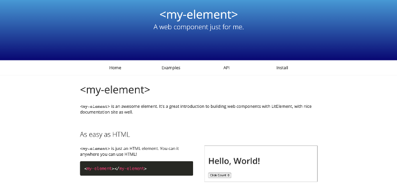
Navigate to the URL listed in the terminal window. You should see something that resembles the following:
Excellent! We’ve got all the tools we need to build a new web component. In the next section, we’ll take a deep dive and learn about the inner workings of the LitElement TypeScript starter repo.
Countdown
Let’s take a quick look at the code to understand each piece that made it work. Open src/my-element.ts and take a look at the following pieces:
/**
* An example element.
*
* @fires count-changed - Indicates when the count changes
* @slot - This element has a slot
* @csspart button - The button
*/
The previous snippet is a comment that’s read by custom-elements-manifest to generate a custom-elements.json file that describes our web components and their APIs. The custom-elements.json file is read by eleventy which is used to generate a static site for our component documentation.
@customElement('my-element')
export class MyElement extends LitElement {
    // Implementation
}
The code above defines a MyElement class for our web component that extends LitElement. We use the @customElement decorator, which instructs Lit to define a custom element called my-element.
static override styles = css`
    :host {
        display: block;
        border: solid 1px gray;
        padding: 16px;
        max-width: 800px;
    }
`;
The static styles property is the recommended approach for defining styles with Lit. Other options include importing styles from a shared export, using inheritance and CSS properties for theming, and constructible style sheets.
/**
* The name to say "Hello" to.
*/
@property()
name = 'World';
In the above example, we define a Reactive Property with the @property decorator that can trigger the reactive update cycle when changed, rerendering the component, and optionally be read or written to attributes.
override render() {
    return html`
        <h1>${this.sayHello(this.name)}!</h1>
        <button @click=${this._onClick} part="button">
            Click Count: ${this.count}
        </button>
        <slot></slot>
    `;
}
The render function is a lifecycle function that gets called to re-render the DOM whenever an update is detected. The render function returns a TemplateResult, in this case, via the HTML tag template literal.
private _onClick() {
    this.count++;
    this.dispatchEvent(new CustomEvent('count-changed'));
}
Handling the @click event is done by the _onClick function. Here we update the count property and dispatch an event after an element updates to rerender the page based on user interaction that changed a property.
declare global {
    interface HTMLElementTagNameMap {
        'my-element': MyElement;
    }
}
The last piece in the file declares an HTMLElementTagNameMap which allows TypeScript to provide good types for our custom element my-element.
Open dev/index.html and take a look at how the instance of my-element is created in HTML.
<my-element>
    <p>This is child content</p>
</my-element>
If we wanted to pass a value for name, we would update our HTML to the following.
<my-element name="bobby">
    <p>This is child content</p>
</my-element>
Last but not least, the content inside of the <my-element> tags will be rendered in a slot. The contents of the <p> tag will be inserted in the place of the <slot> tag in the <my-element> template.
<h1>${this.sayHello(this.name)}!</h1>
<button @click=${this._onClick} part="button">
  Click Count: ${this.count}
</button>
<p>This is child content</p>
Awesome! Now that we understand how all the pieces work, we can assemble something more complex. In the next section, we’ll go through building a web component.
T Minus 0 😬
Building Lit Elements is an awesome experience that feels similar to React development. In the previous section, we deeply explored the tools offered by the LitElement TypeScript starter repo. Now that we understand our tools, it’s time to start building our components.
First, we’ll make a few tweaks to the starter template to improve the developer experience. Next, we’ll build a giant web component that fetches a Medium RSS feed and displays several preview cards. Finally, we’ll reorganize our project into small, well-encapsulated components that are easy to test.
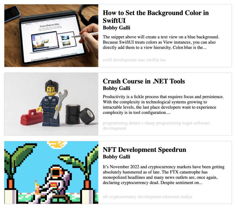
After completing the next section, you’ll have built something that resembles the following.
Blast Off 🚀
The default template configuration outputs all the build artifacts in the same folder as our source code which is pretty annoying. We can change that behavior by updating .eleventy.cjs, .gitignore, dev/index.html, rollup.config.js, tsconfig.json, web-test-runner.config.js, and package.json. If you’d like help updating your configuration to build to a dist folder, please view this diff.
Please read on if you’re not bothered by these files in your working area!
Let’s rename the my-element component. You can leverage your IDE’s search to ensure you update all the code references from MyElement to MediumFeed, as well as the template references to my-element to medium-feed, and rename the files my-element.ts and my-element_test.ts to medium-card.ts and medium-feed_test.ts respectively.
You can view this and compare your changes with this diff to check your work.
Now that we’ve got a good working area, the easiest way to start is to dump all of the component functionality into medium-feed. First, we’ll allow the user to specify a url property for a Medium RSS feed. We’ll use the RSS feed URL to fetch an XML collection of articles and convert it to JSON. Finally, we’ll map each article to an HTML card that contains a thumbnail, header, body, and footer.
In the code above, we’ve added a comment that describes the component and defined our custom element using the @customElement decorator. We added several default styles and more styles that can be themed via CSS variables. We declared the URL and count input properties and used them to fetch data via the connectedCallback lifecycle hook. The RSS feed data is fetched via an endpoint that converts it to JSON, saved to the component’s state, and we map each result to an array of cards.
Run npm run build:watch in one terminal and run npm run serve in another terminal. When the build finishes, navigate to the URL displayed in the terminal, usually https://localhost:8000.
The code from the snippet above should yield the following.
This is a pretty good-looking web component, but the code is unwieldy and will prove hard to test. Let’s extract some pieces from this web component and explain how they work. We’ll extract the thumbnail, header, body, footer pieces to build a generic card that we can use in the medium-feed component.
First, we’ll create a card folder in the src directory. In the card folder, create medium-card-thumbnail.ts and paste the following contents:
The medium-card-thumbnail element allows the consumer to specify the value for the src property which is used by the template to render an image. We use the :host selector to style the components containing the element and give them the property display: flex. The img style also contains a bunch of CSS properties that we’ll use later to allow the consumer to override our default styles to control the rounding of the image’s corners and change the thumbnail size.
Let’s also create a medium-card-header.ts file in the card folder.
The medium-card-header element’s color can be set by its consumers via the --medium-header-color variable. The values of the header and subheader properties are rendered in h2 and h3 tags respectively.
We can create a medium-card-body element to display a snippet of text within the card.
The body property allows the user to set the component’s body contents. The overflow: hidden and text-overflow: ellipsis are a bit aspirational at the moment. These styles don’t quite work in such a way that they truncate the text at the bottom of the body element. We’ll leave this as an exercise to the reader - if you find a solution to control overflow with CSS rules, please let us know in the comments!
Add the last subcomponent for our card to a new medium-card-footer.ts file.
The medium-card-footer content is set via the footer property. Similar to the other subcomponents, the footer accepts a --medium-footer-color variable that allows the consumer to theme it. The rest of the component is rote stuff that we’ve seen before.
We can organize all of these pieces in a new medium-card component.
The snippet above is where things start to get interesting.
We define several styles and properties for the component. The component also accepts several CSS variable values passed to the child components. If a consumer wants to style an instance of medium-card they can do so by setting values for --medium-card-header-color, --medium-card-body-color, --medium-card-footer-color etc. The CSS variable values are passed to the child sub-components, allowing the consumer to theme the card as one cohesive unit. Our design also allows the consumer to compose their own version of a card, using the themeable subcomponents as building blocks.
Below is an example of how a consumer can compose their own card is to create a new card that omits the thumbnail:
Finally, we can refactor our medium-feed component to leverage our new medium-card.
We now have a much cleaner implementation that is easy to grok. Again, we relay several CSS variables to child components to facilitate component theming. The connectedCallback lifecycle hook is used to fetch the Medium RSS feed XML and convert it to JSON.
The internal _state.posts property to an array of MediumPosts and map each post to a medium-card. We use trimContent to remove all HTML tags from our article’s body and truncate the content at 32 words. The beginning of our card’s body is generated from the third paragraph in the article simply because that seemed to work best in testing.
There’s a bug lurking in the trimContent snippet above because not all articles are guaranteed to have three paragraphs. If you spotted the bug, nice work! We’ll leave this as an exercise for the user to fix.
You’ve successfully built a custom, reusable web component that can fetch a collection of Medium articles and display them as preview cards — nicely done! In the next section, we’ll develop a strategy for testing our web components and learn techniques to help us work with other developers to build more sophisticated web components.
Testing
Testing web components can be tricky, and writing effective tests requires good design and clever thinking. Writing tests is a great way to document how features work so that future developers can iterate quickly and effectively. Well-written tests prevent regressions without duplicating work done in other tests. In the final section of our Lit Elements tutorial, we’ll discuss testing strategy, review tests from our medium-feed example, and dive into specifics.
Testing Basics
We started with a giant web component in the previous article and broke it into smaller subcomponents. Breaking the monolithic component down into bite-sized pieces helped us organize our project. Additionally, small, well-encapsulated components are easier to test and reason about. As a rule of thumb, if something is difficult to test, it likely needs to be split into smaller pieces and/or simplified.
Let’s start with some tests of our subcomponents. The simplest component to test is the medium-card-body.
The first test creates a medium-card-body and asserts that it’s an instance of our MediumCardBodyElement. Next, we set the value of the body property and assert against the Shadow DOM to ensure that the body property was rendered correctly. Finally, we added a test to ensure that if we set the --medium-body-color CSS variable changes the body’s color.
We use the style attribute of the medium-card-body element to inject the value of our CSS variable. To check the CSS variable is wired up correctly, we use the getComputedStyle function to get the color property and assert it equals the value we injected via the styles attribute.
A slightly more sophisticated example of the strategies used to test medium-card-body can be seen in the tests for medium-card-header.
In the medium-card-header tests, we assert that the component correctly renders the values of header and subheader in h2 and h3 tags respectively. The querySelector function is used to get the Element of interest so that we run assertions against its properties. We use the optional-chaining ? operator and the non-null assertion operator ! to tell the TypeScript compiler that we accept the possibility that the object might be undefined. Once we have a reference to the h2 and h3 elements, we can assert that their color equals the value we specified with --medium-header-color.
Advanced Testing Strategies
So far, we’ve tested that subcomponents’ property values are rendered correctly and that CSS variables can override component styles. Since our subcomponents are used to implement the medium-card components that are important to test the integration of these components and ensure values are passed correctly from the parent component to the child component.
At first, it might seem like a good idea to test a fully rendered component tree and verify values passed to child components are rendered correctly. Unfortunately, testing the rendered child components can get complicated, and a lot of our testing logic would be duplicated between the parent component and the tests we wrote for the child components.
Thanks to TypeScript, we can avoid duplicate code and safely test everything up to the boundary of our parent and child components.
In the snippet above, we broke a large test into two smaller, more targeted tests. Instead of testing the medium-card component rendered entirely, we can test up to the border of a medium-card and any child element. This works because we already have test coverage of the child components’ implementations and avoid duplicating logic between tests.
Breaking a monolithic integration test into smaller unit tests achieves our goal of writing tests that prevent a future developer from renaming a property in a child component and forgetting to update the reference in the parent component.
A concrete example of testing up to the medium-card component’s boundaries can be seen in the medium-card-header test. We test that the header property is set correctly on medium-card-header and can be guaranteed they will render correctly because we’ve already tested the rendering of a medium-card-header in a separate test.
It’s important to note that testing to the boundary only works if you can leverage the compiler to ensure type-safety. When you change a property name in a child component, you need some warning or error that prompts you to update any references in the parent. To ensure type safety in our tests, we can use the as keyword to add a type-assertion to the result of querySelector.
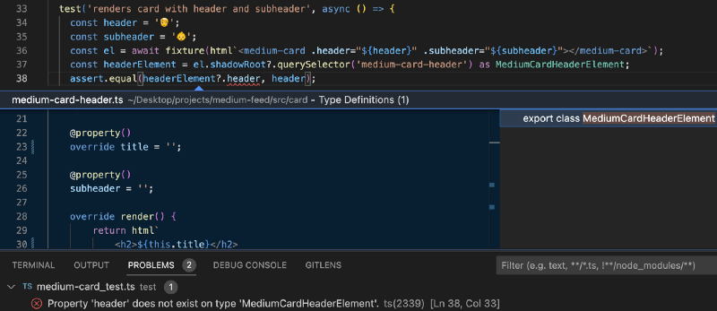
Since the querySelector result is properly typed, changing the property header to title in medium-card-header yields a compile error. Additionally, in VS Code, you use the Rename Symbol feature to update all references safely header to title and avoid the problem entirely!
Now that we’ve thoroughly tested the medium-card component, let’s take a look at our medium-feed component.
Spies
Our medium-feed component makes a network call to get data from a Medium RSS feed and populate the component. The network call is done with fetch, which is an asynchronous operation. We don’t want to perform any “real” network calls in our tests because they run slowly, and the data on the sending end is subject to change.
Instead of making a real network call, we can use a Sinon spy (aka stub) to mock the network call and return fake data.
We create a fake response by importing article from article.ts. The fetch implementation is stubbed out, and the returns function instructs our stub to return a fake response. The stub allows assertions to be performed against the arguments that are used to invoke fetch via calledWith. The test lifecycle hooks setup and teardown are used to create and destroy the stub after each test to prevent operations that modify the stub in one test from affecting other tests. Please note, depending on which test framework you’re using setup and teardown might be named beforeEach and afterEach respectively.
Waiting
Our medium-feed an asynchronous network request populates the component’s content, and we have to wait for it to complete before we can perform assertions.
The easiest way to ensure your component is valid before performing assertions is by using waitUntil.
The waitUntil function accepts a function parameter that is run until the inner condition returns true (aka a predicate). Additionally, the second parameter passed to waitUntil is a message to display if the wait times out without the predicate returning true. In this example, we use a predicate that returns true when the number of rendered medium-cards equals the number of expected cards. Once the test has waited for the cards to be rendered it is safe to perform assertions on the fixture.
Mission Complete
This series covered the ins and outs of the Lit Element Starter Template and demonstrated how to make a well-tested, reusable web component. If you’d like to take your web component to the next level, consider publishing your web component to npm or deploying your web component on your blog. If you found this tutorial useful, please leave a comment.
Thanks for reading!
Want to Connect?
If you found the information in this tutorial useful please subscribe on Hashnode, follow me on Twitter, and/or subscribe to my YouTube channel.


